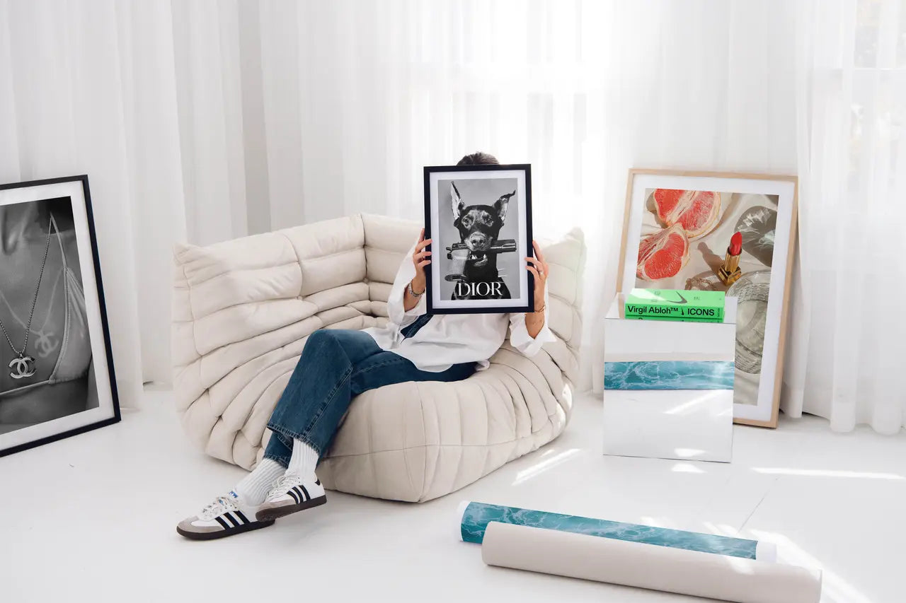
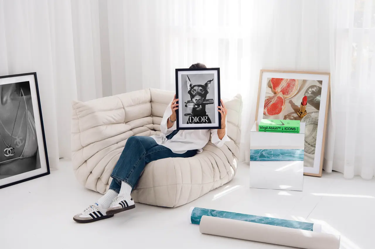
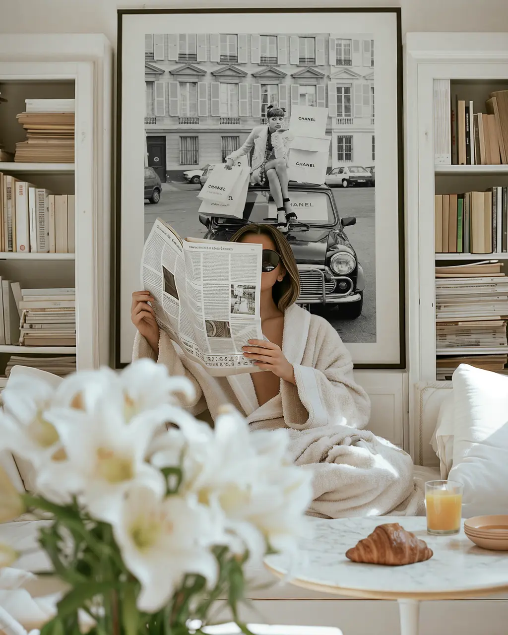
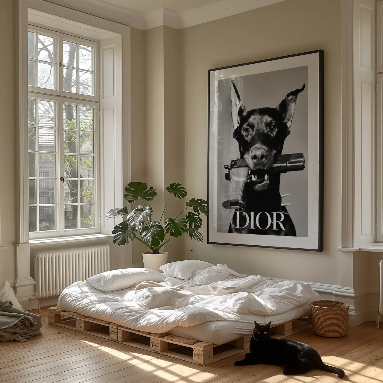
Introduction to Fashion Posters as Home Decor
Fashion posters are not just pieces of paper with images of models and designers; they are versatile tools that can be utilized to transform your living space into a stylish sanctuary. Incorporating fashion posters into your home decor can add a touch of glamour, sophistication, or whimsy, depending on your personal style. Whether you’re a fashion enthusiast or simply looking to elevate the aesthetics of your home, fashion posters offer a unique way to make a statement.
Imagine walking into a room adorned with elegant fashion posters featuring iconic couture designs or vintage Vogue covers. The walls come to life, telling a story of timeless elegance and creativity. Fashion posters have the power to evoke emotions, spark conversations, and inspire creativity in the beholder. They serve not only as decorative pieces but also as windows into the ever-evolving world of fashion.
As you explore the realm of fashion posters for home decor, you’ll discover a vast array of styles, themes, and artistic interpretations to suit every taste. From minimalist black and white sketches to vibrant pop art prints, the options are endless. Whether you prefer bold statements or subtle accents, there is a fashion poster out there waiting to become the focal point of your interior design vision.
In this guide, we will delve into the art of incorporating fashion posters into your home decor to create a visually captivating and aesthetically pleasing statement wall. Get ready to explore tips and tricks that will help you unleash your creativity and transform your living space into a reflection of your unique style and personality.
Choosing the Right Fashion Posters for Your Space
Selecting the perfect fashion posters for your space involves more than just picking out images that catch your eye. It requires a thoughtful approach that considers the overall theme of your room, the existing color palette, and the ambiance you wish to create. Before you begin, take a moment to envision the look and feel you want to achieve with your statement wall.
One of the key factors to consider when choosing fashion posters is the size of the space where they will be displayed. Larger rooms with high ceilings can accommodate oversized posters that make a bold impact, while smaller spaces may benefit from a collection of smaller prints arranged in a gallery wall style. By striking the right balance between the size of the posters and the dimensions of the room, you can create a harmonious visual effect that draws the eye and enhances the overall aesthetic.
Furthermore, think about the color scheme of your room and how the hues in the fashion posters will complement or contrast with the existing decor. Whether you opt for monochromatic prints that blend seamlessly with the surroundings or colorful artworks that pop against neutral walls, the choice of color can significantly influence the mood and energy of the space. Experiment with different combinations to find the perfect balance between cohesion and contrast.
When it comes to themes, consider selecting fashion posters that resonate with your personal interests, passions, or design preferences. Whether you’re drawn to vintage fashion photography, modern abstract designs, or classic runway moments, let your personality shine through your poster choices. Mixing and matching different themes can add depth and dimension to your statement wall, creating a visually stimulating experience for both you and your guests.
Ultimately, the goal of choosing the right fashion posters for your space is to create a harmonious visual story that speaks to your individual style and taste. By curating a collection of posters that reflect your personality and design sensibilities, you can transform your walls into a captivating gallery that showcases your love for fashion and art.
Creating a Cohesive Theme with Fashion Posters
Once you’ve selected the fashion posters that resonate with your style and aesthetic preferences, the next step is to create a cohesive theme that ties everything together. A cohesive theme ensures that your statement wall appears harmonious and well-balanced, rather than a random assortment of artworks. Here are some tips to help you achieve a unified look with your fashion posters:
Start by establishing a central theme or motif that will serve as the anchor for your wall display. This could be a color scheme, a specific fashion era, a favorite designer, or a recurring pattern. By giving your collection a unifying element, you create a sense of cohesiveness that guides the viewer’s eye and creates a visual connection between the posters.
Consider the layout and arrangement of your fashion posters to enhance the overall theme. Whether you opt for a symmetrical grid, an organic gallery wall, or a thematic grouping, the way you position the posters can reinforce the central motif and create a sense of flow and continuity. Experiment with different arrangements until you find one that best showcases the unique characteristics of each poster while maintaining the unity of the display.
To further enhance the cohesive theme, pay attention to framing and matting options for your fashion posters. Consistent framing styles, colors, and mat sizes can unify even the most diverse collection of posters, creating a polished and sophisticated look. Additionally, consider incorporating complementary elements such as decorative sconces, shelves, or accent lighting to enhance the overall impact of your statement wall.
By taking a thoughtful and intentional approach to creating a cohesive theme with your fashion posters, you can elevate the visual appeal of your space and infuse it with personality and style. Whether you aim for a sleek modern aesthetic, a bohemian vibe, or a glamorous Hollywood regency look, fashion posters offer a versatile medium to express your design vision and make a bold statement in your home.
Arranging and Hanging Fashion Posters Like a Pro
Once you’ve chosen the perfect fashion posters and established a cohesive theme for your statement wall, the final step is to master the art of arranging and hanging them like a pro. Proper arrangement and placement can enhance the impact of your posters and elevate the overall look of your space. Here are some tips and tricks to help you showcase your fashion posters with style:
Before you start hanging your posters, consider creating a mock-up or layout on the floor to experiment with different arrangements. This allows you to visualize how the posters will look on the wall and make any necessary adjustments before hammering in nails. Play with spacing, alignment, and balance to create a visually pleasing composition that showcases each poster to its full potential.
When it comes to hanging the posters, invest in quality hardware such as picture hooks, nails, or adhesive strips that can bear the weight of the frames securely. Use a level to ensure that your posters are straight and evenly aligned, creating a polished and professional finish. For gallery walls with multiple posters, start by hanging the central piece at eye level and work outward, maintaining equal spacing between each frame.
To add visual interest and depth to your statement wall, consider incorporating elements of varying heights and textures alongside your fashion posters. This could include decorative mirrors, sculptural pieces, or potted plants that complement the aesthetic of the posters and create a dynamic visual display. Mixing different elements adds dimension and personality to your wall, making it a focal point of your room.
Whether you prefer a structured grid layout, a salon-style arrangement, or a curated mix of frames and artwork, the key to hanging fashion posters like a pro is to follow your creative instincts and let your personality shine through. Embrace the process of experimentation and iteration, allowing yourself the flexibility to adjust and refine your display until it perfectly reflects your unique style and taste.


Bringing Your Favorite Icons Home: The Art of Selecting Pop Culture Posters